Case Study
The strategic redesign of a website
Opportunity for a strategic redesign
HabitAware is a company that is focused on developing products and services focused on helping people who have subconscious body-focused repetitive behaviors, or PFRB.
They sought outside help in developing a new strategy to help them with problems where a significant portion of their customers — people who purchased their signature hardware, a ‘smart bracelet’ — ended up being dissatisfied.
According to HabitAware, these people were not purchasing the additional products that would likely help them, e.g., video training courses and peer coaching. It seems that as HabitAware’s methodology evolved — and was shown to be more effective than the bracelet alone, their website content didn’t keep up.
My team hypothesized that by emphasizing the company’s mission and its innovative approaches — over its hardware-related product offerings — they would establish credibility and help guide guide customers towards a solution that was best suited to them.
In addition, we suspected that if the company were to explicitly explain and promote their methodology, people would be more willing to purchase a more holistic product package.
My role & collaborations
Most of the work on this project was performed as a team. I was one of four UX generalists, and we collaborated as equals. A senior UX researcher was also involved at a few points in the process.
See below for additional details of how we collaborated.
Our research
The project began with reading of a project brief, which was created by the senior researcher in collaboration with the client. The team of generalists used this to generate a large collection of knowns, unknowns, and assumptions about the project. These were used by the senior researcher to generate his interview questions.
The team then observed the researcher’s extended interview with the company’s founder, Aneela Idnani.
Following this interview, I collaborated with the other UX generalists to synthesize our notes.
Together, we performed some deep-dive research of the company and BFRB using primary and secondary sources. This included identifying all of the potential consumer touchpoints.
Aneela is the primary inventor of the HabitAware’s award-winning, signature product: a wearable, programmable bracelet that haptically informs users when they are starting to engage in unwanted behavior.
Words to guide us
Before starting the design phase, our team created a strategy statement and some guiding principles to guide our work. We would refer to these throughout the duration of our project; they helped to ensure that everything we did would be in service of a primary objective.
Strategy Statement
All user experience touchpoints for HabitAware will help people with BFRB and their caregivers to feel seen, safe, and supported so that they are able to make lasting changes in their journey of overcoming BFRB. We will do this by focusing on building trust through thought leadership, human-centric content, and providing meaningful interactions while using HabitAware products.
Guiding Principles
TRUSTED: Brand perception is viewed through the lens of product quality, positive interactions, and evidence-based information.
SUPPORTED: People may not be aware of all the available resources and should be informed and encouraged to make educated decisions.
SAFE: Individuals with Body-Focused Repetitive Behaviors (BFRBs) often experience a sense of shame and value maintaining their anonymity.
SEEN: The recovery journey involves multiple stages, and individuals will engage with us based on their current phase of progress.
Our proposed solution
Using the touchpoints that we identified earlier, we generated an experience journey map that demonstrated a path that a potential customer could follow — including condition education, gesture awareness, mindset shifts, and community support.
With data in hand, we identified some areas of focus, split up the work among us, and subsequently created several prototypes aimed at achieving the clients goal, i.e., clearly communicating all of their touchpoints / offerings to customers, as well as why each is a needed item on the path to BFRB recovery.
Specifically, we created some web pages and app screen concepts:
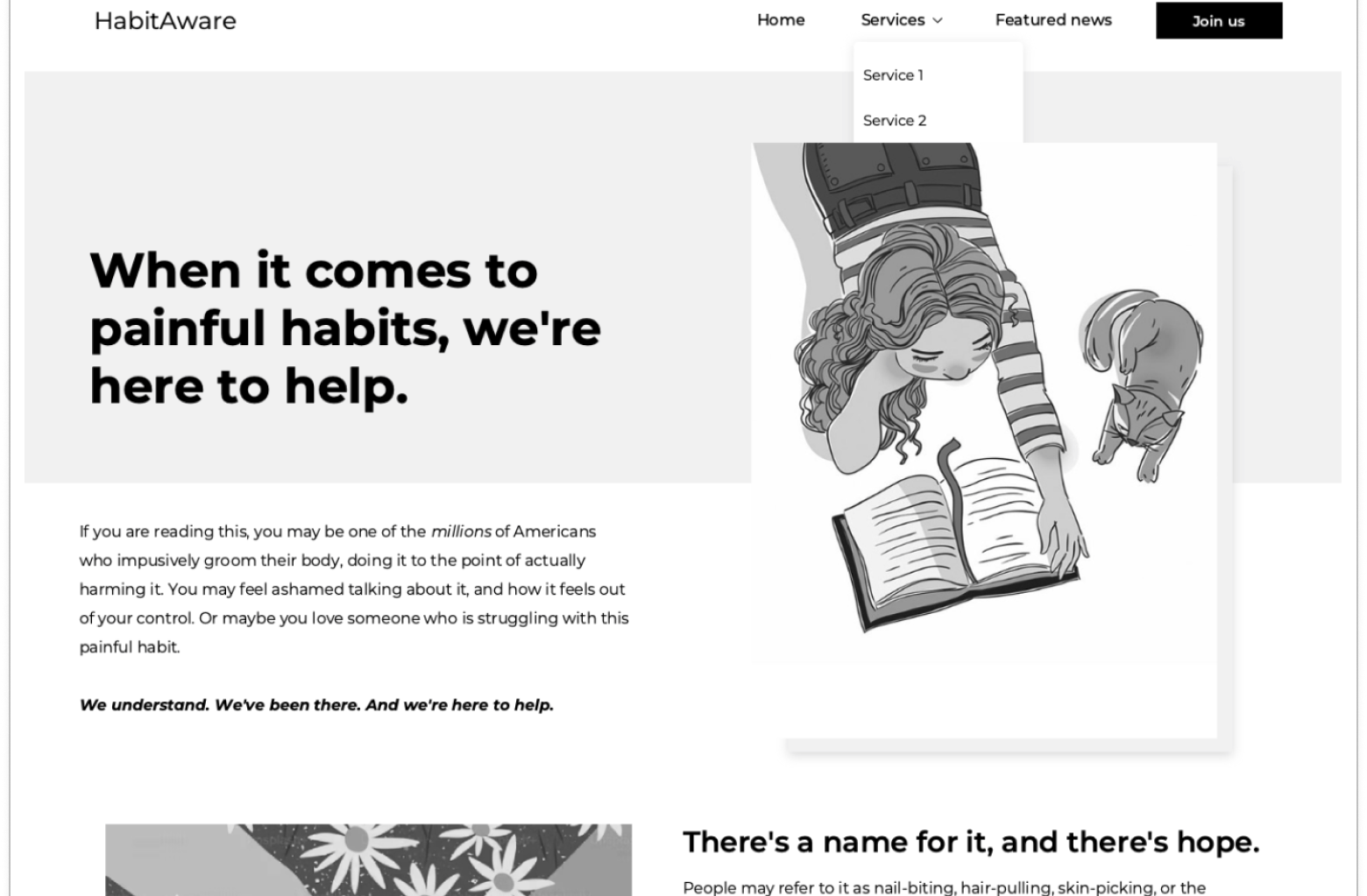
A Home Page, which used a new content strategy, including
imagery that was primarily illustrations and much less photography
a different tone in writing
emphasis of the company’s strengths in thought-leadership, its innovations in addressing PFRB
de-emphasis in the company’s hardware and technology
An About page that told the story of the companies founder, including her personal Journey with PFRB.
App screens that put a greater focus on personal growth and health, designed so they looked less like screens used for workout apps.
These were presented as low-fi wireframes, but we expect that they would follow a similar content theme shown in the Home Page concept, e.g., illustrations
We also analyzed and annotated their existing page for partnerships with health professionals, which included ideas for improvements.
Our experience journey map
Our Home page (see full PDF or annotated PDF)
Our About page (desktop, tablet, and mobile)
Challenges
There were some challenges, however. The biggest one was limited access to existing research information and other data from the company.

